


Comic Book Resources, 2014
[The following is part of Greg Burgas's series of features over at Comic Book Resources that looks at a different comic book each day. Day 20 is Seth's Fantastic Four/Iron Man: Big in Japan. The original was published on January 20th 2014 and can be found here.]
Year of the Artist, Day 20: Seth Fisher, Part 5 – Fantastic Four/Iron Man: Big in Japan #3

Every day this year, I will be examining the artwork on a single comic book story. Today’s artist is Seth Fisher, and the issue is Fantastic Four/Iron Man: Big in Japan #3, which was published by Marvel and is cover dated February 2006. This scan is from the trade paperback, which was published in 2006. Enjoy!
Fisher’s only long-form work for Marvel (he drew a Spider-Man Unlimited story, which is included in the trade) is this four-issue mini-series, which might be his masterpiece. It’s hard to pick one masterpiece by Fisher, since so much of his work was so good, but on Big in Japan, he really stretched his creative muscles, and the result is a stunning work of art. I haven’t read much by Zeb Wells, but this is by far the best thing I’ve read by him, and I can’t help wonder if it’s largely due to Fisher’s influence. On this mini-series, Fisher’s manga influences are very evident, and his love for pop culture – especially Japanese pop culture – is also front and center. Of course, the issue I want to look at doesn’t take place in Japan, but Fisher’s style is still very Japanese-influenced. Like I did yesterday, I want to look at several pages in a row, but in the middle of these pages, Fisher put two double-page spreads, which I didn’t post because I couldn’t fit the entire book on my scanner and doing them separately would not look as good. So that’s the way it is. But let’s check these pages out!

Joe Caramagna letters this, and although he doesn’t do it by hand, the crunching of the letters using some kind of digital magic is pretty cool. I’m not sure if Fisher or Caramagna came up with it, but it’s a neat trick. Fisher does some nice expressive work with the characters – you can see Reed’s mind working when he looks at the shadows perpendicularly in Panel 3, and Ben’s face in Panel 5 is very nice. Wells, of course, goes a bit meta here, with the shadows referring to the “pages,” but if you’re going to do that, it helps to have such a gonzo artist like Fisher drawing your script.

Despite the heavy manga influence in this comic, notice on this page and the previous one that Fisher seems to be using some Amerindian motifs, with the slotted rocks that look like animals on the first page and the beasts with painted lines on their faces on this page. The heroes are at the North Pole, so there’s no good reason why this should be. Maybe Fisher just thought they looked cool.
The use of body parts in Panel 2 (well, on the first page, too, with the eyes, but really full-blown here) is part of what makes the comic a bit creepier than we think it will be and also foreshadows the rise of the Apocalypse Beast (which we’ll see below) and its size, which allows Sue to go inside it and attack it from within. The chamber in Panel 2 is almost-but-not-quite horrifying, with the eyes and teeth and fingers forming a weird tableau, while the tongue with the man-shaped impression on it extending lasciviously from the wall. It’s an extremely weird place, but that’s part of what makes Fisher great.

Fisher gives us a 16-panel grid that feels like an info-dump (because it kinda is) but is rescued by some cool work. First, Tony’s weird dance in Panel 2, when his “sensors are going haywire,” is hilarious. The way Fisher simply shows Dr. Yamane going about his business as he puts on one of the weird suits and reveals himself as a villain (which he’ll do on the next page) is neat, because he does it so casually. Ben’s look in Panel 6 is pretty priceless, too. In fact, all of the facial expressions are quite good – Reed’s in Panel 1 is the look of a man who’s a bit too jazzed by learning things, for instance. This page also creates a nice sense of compression, as Fisher blitzes through the build-up so that Dr. Yamane can release the Apocalypse Beast and Fisher can nuts over the next several pages, starting with our next example.

Part of the fun of Big in Japan is Fisher’s use of sound effects (I showed some of them here), as we see on this page. Whatever Yamane is doing requires a “pmiif,” a “zgork,” a “snad,” and an “er …” Also, instead of using blurred lines to show Yamane moving all his limbs, Fisher just draws extra ones. Why the hell not?

After a double-page spread in which Dr. Yamane manages to break through the dimensional wall and summon the Apocalypse Beast, we get this page, where Wells and Fisher go a bit more meta. Ben’s arm doesn’t get sheared off; the shadow cuts through the page on which he is drawn, so when Fisher draws him again, his arm is fine. This is a really nicely-designed page – the shadow forms an arc to keep our eyes from drifting too far down, so we move from Ben in the inset Panel 2 straight down to the third panel, which flows upward and to the right. The shadow’s intrusion into that space helps draw us down to the giant eye at the bottom, which also becomes a panel border. Finally, Fisher cleverly twists Reed’s neck in the final drawing to show reality twisting. It’s a bit on the nose, but because the actual twisting of his neck is subtle, it works. It leads directly to this:

This might be one of the ten best comics pages ever drawn. ‘Nuff said!

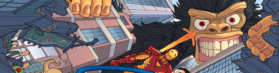
As the Apocalypse Beast is breaking through into the comics world from the fifth dimension, Wells and Fisher can be all meta without being too obnoxious about it. It gives Fisher an excuse (not that he needs it) to have the Beast rip past the panel borders, as we see in Panel 1. Notice, too, that the Beast seems to be moving between the panels, if we accept that the small parallelograms with the characters in them are comic book panels. So it becomes more than just the Beast breaking through panels, it becomes the Beast ripping into the comic itself. Fisher’s sense of humor is always present, as we see in Panel 2, where he provides a handy snip-’n'-save reference guide for how big the Beast is. He does a nice job with the comedic look of panic on our heroes’ faces – including Iron Man’s – in Panel 3, as well.

Dr. Yamane himself has been able to pierce the dimensional wall, as it seems that he is now outside the comic book, although, as we’ll see, he doesn’t stay outside very long. Once again, we get a nice vision of the Beast breaking into the comic, and Fisher’s rubbery Mr. Fantastic looks very cool as he pulls a King Arthur and his knights.
After another double-page spread where we see the Beast for the first time, we get this page:

Fisher’s infantilizing of the characters is important on this page, because there’s no way they would be able to fit on the page with the Beast if the Beast is as big as we’re supposed to believe. So Fisher wants to draw the entire Beast (which is, of course, insane and hilarious), but he wants to draw the heroes running away. Turning them into abstract child-like figured minimalizes them, so that we know, instinctively, that they’re smaller than they are on the page. It also makes them even more helpless against the Beast, as we see in the final panel, when Yamane, whom Fisher draws as a normal adult in the preceding few panels, becomes smaller and child-like as the Beast approaches him (to kill him by stepping on him). The infantilization of characters seems to be a standard trope in manga, too (it is in a lot of the manga I’ve read, but I haven’t read a lot of manga), so this links the art back to that tradition, as well.

This final panel is slightly disappointing. The foot is tremendous, as it breaks just enough of the panel border to remind us that the Beast is extra-dimensional but not enough to be obvious. I love the fact that Fisher gives the toes prints, which is a cool detail. However, I don’t love turning Reed and Johnny into ants. We already know the Beast is gigantic, and the metaphorical way Fisher draws them is just confusing. We see that they’re dots as the foot comes down, so we can already make the connection that they’re like ants to the Beast – the literalization of the metaphor is unnecessary. Plus, we never see Dr. Yamane after that last drawing on the previous page, and we don’t see the rest of the team in this panel. It would have been funnier if we had seen every character, each reacting to the foot coming down in different ways – Yamane, of course, resigned to his fate, but the others with different facial expressions as the foot comes down. Turning only two characters into ants when all the characters are there (and, naturally, none of the heroes get stomped) and making the metaphor far too literal is an odd misstep from Fisher. Oh well.
Seth Fisher died (in an unusual circumstance) shortly after finishing this mini-series – the final issue might even have shipped after his death – and the world was deprived of a superb artist. There have been several times over the past eight years (30 January will be the eight-year anniversary of this death) when I’ve thought that he would have been perfect for a project, but alas, it was not to be. I hope you enjoyed this look into his artwork. Tomorrow, we’ll go a bit old-school again, with an artist who I believe got worse as he got older, and I’d like to check that out and see if I’m right or wrong (probably the latter). I hope you come back to see who it is! You can find other old-school artists in the archives!
- Log in to post comments