


Don't Believe the Evidence 02 - Seth Fisher
[The Following is from the Supervillain blog maintained by Sean Witzke. The discussion forms part of an ongoing survey of comic artists with Jared Lewis in which each lists comic artists that he thinks is somewhat underappreciated by mainstream critics. Seth is on Jared's list. You can view the original blog post here.]
Sean Witzke: Okay so next up, we have one from your list, Seth Fisher – probably out of all these guys he’s the one who produced the smallest body of work, until you see exactly how much information and style each of his pages had.
Jared Lewis: He certainly was a guy that liked drawing for the sake of drawing. The type of guy who didn’t just work on a page, but create an elaborate universe of things to look at. Years on, you can go back in some of his books & still find new things not only by the book, but per page.
SW: His stuff is way more in the extreme end of what can be done with detail, but without ever becoming of those guys who just add all the extraneous elements to shitty images. His figures are always streamlined, it’s just that he would always avoid the simplicity that a lot creators strive for. His panels are packed, and there was a feeling he was maintaining an equilibrium of how much detail he could add (which meant designs, locations, fucking crazy non-story elements that popped up for a panel) and still be readable.
JL: That may come from his background in Math. After going to school for that, he talked about sometimes tackling his pages as if they were problems to solve, which is weird & alien to the way a lot of other artists do things, certainly. There’s a great deal of geometry going on, & that’s without really bringing up the ornate architecture he’d go into sometimes. He optimized his page real estate to really milk the most storytelling, emotion, or detail out of everything.
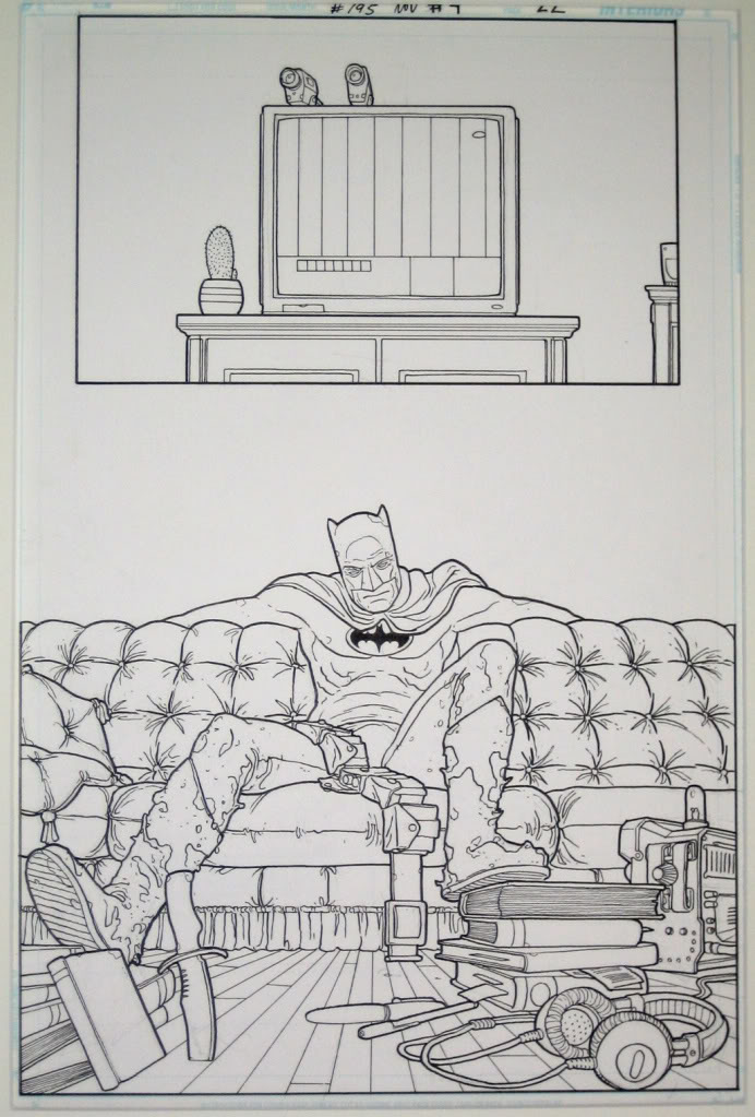
SW: I think I first became aware of Fisher when someone posted a page of his on some forum 5 or so years ago – I wanna say it was from VertigoPOP! Tokyo but it might have been from the Flash special he did, and then the first book I had the chance to pick up was the Batman: Snow arc he did with JH Williams and D Curtis Johnson.
JL: My first memory was seeing solicits for that Green Lantern: Willworld book he did with J. DeMatteis. I wasn’t a DC guy, & if I ever had to pick a GL, I opted John Stewart because the debate between the other two seemed too nerdy to me. As a story, it didn’t particularly jump out at me, but the art? The art looked crazy in every solicit I saw. Unfortunately, I was in Florida at the time without my own car, & the one shop I could get to never got more copies in. Around the same time, I had heard about the VertigoPOP! line & being a nerd for travelogues & Japanese shit, the Tokyo struck me as a must buy. Despite it not even register it as being the same guy, that was my first book by him. I was blown away by the amount of love he gave each & every background in that. From the most sprawling, sensory-overloading shopping districts, to the inside of someone’s miniscule, almost casket-sized apartment, the level of detail was always phenomenal. And I knew I needed everything this guy did. It wasn’t even until years later, like an asshole, I figured out that it was the same Seth Fisher on both books.
SW: The thing I’ve noticed rereading all of Fisher’s work getting ready for this, is that while he’s definitely an eye-candy artist, pushing that part, that he also did a great job at telling the story. Every weird device or design choice he makes, they are used to suck you in as a reader, rather than step back and go “oh cool look at the smoke coming out of Commissioner Gordon’s ears” or “wow, insane cutaway layout of Monster Island”, you say those things late on reread because he can invest you.
JL: You see, I would look at some of that stuff & find those little flourishes jumping out at me in the first read. No one, at least remotely close to the mainstream was adding things like that. That’s one of the things that I always really liked from the beginning. Without bashing you over the head with manga influences, he was a guy that wasn’t afraid to add a little something that would push an idea further without making it too distracting or blatantly outlandish.
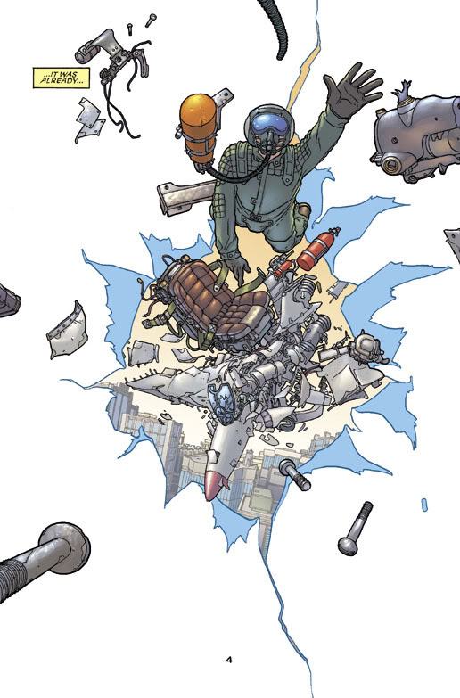
SW: Fisher is a weird case because while the writers he worked with weren’t great genre-defining voices, they were almost universally better-than-average underrated fringe superhero writers. John Rozum and DC Johnson had moments of being downright amazing, and played and I know that David Brothers loves Zeb Wells to death, though I think hooking up Fisher with a Kaiju plot was all he needed to do to make that book great. I dunno, I haven’t read anything else by the dude. But – most of the guys we’ve picked are writer-artists in some capacity, with the exception of Bachalo and Weston, and there’s a thing going on with all three of those guys where they took their styles in one direction and then went HARD in that direction their whole career. Fisher’s work is kind of “pure” comics (as wrong-headed as that word is it’s the only one that fits), in that the guy could define something without having authorial input, just him drawing Batman talking was going to be a unique thing because he was the only one who could do it his way.
JL: He was working with a whole other set of tools than the other guys. I think writers that worked with him were pretty good at figuring that out. So rather than restricting him, I think they gave him room to play around with the pages. His spin on whatever the subject matter was just going to be an inevitable result. And chances are it was going to at least be pretty to look at. What other things really stuck out to you?
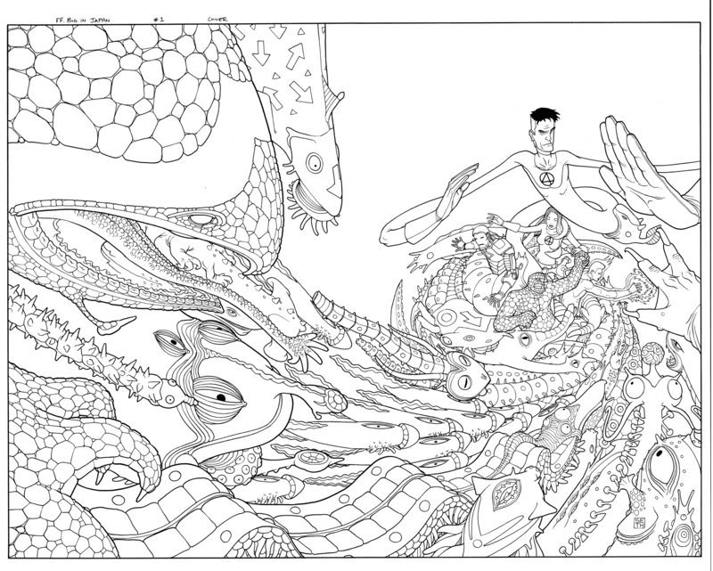
SW: I’m a complete sucker for cutaways and diagrams, like the Monster Island thing in Big In Japan, and the guy’s figures are usually very static, but he had a little of what Allred has in that static figures are totally in motion, and have a lot of kineticism in the panel, like hi-speed photographs.
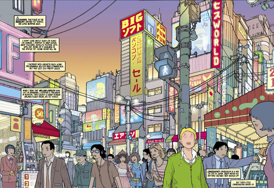
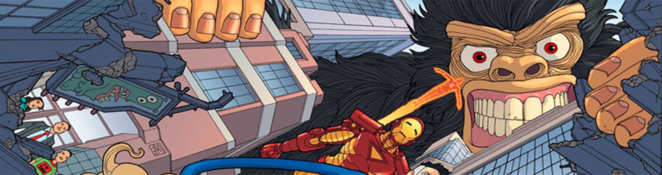
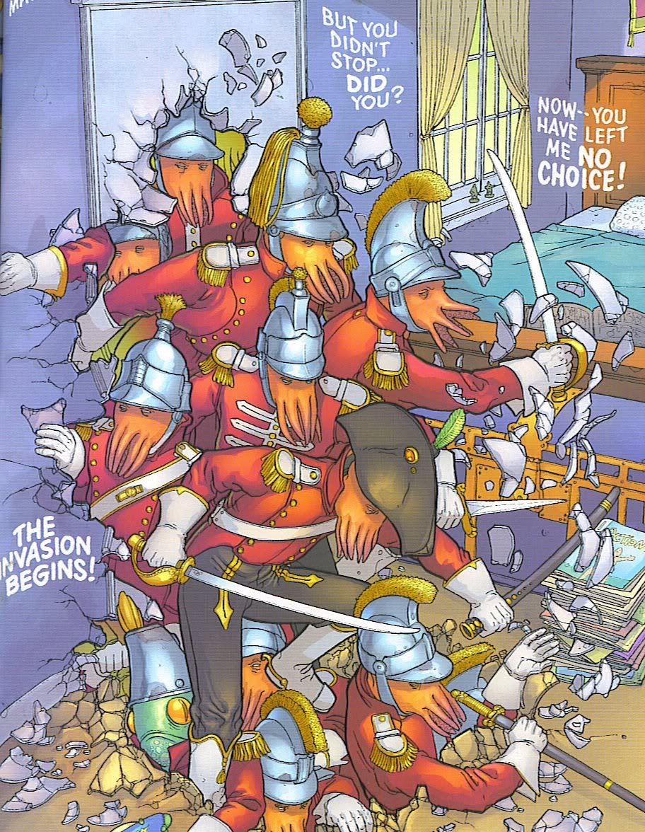
JL: His architecture always really got me. One look & it was very apparent that he spent time in Japan because he drew that sprawling Tokyo metro-clutter better than most Japanese artists did. In both VertigoPOP! & the FF/Iron Man mini, where it’s getting destroyed. And then, once things get pretty street level, the vast cityscapes get fewer & further between but the level of detail’s still there for every alley, pedestrian walkway, TV studio, or tatami matted apartment. Even in Willworld, in an early double page spread, he mixes that same sense on an Old West saloon in close proximity to a Traditional Chinese temple, some Arabesque turrets, a futuristic industrial complex, a Roman villa & whatever other surreal ideas he had floating around in his head. It was haphazard & yet it still all meshed in consistency. The book is supposed to encapsulate a dream state, & he really pulls it off. Well.
SW: So favorite book of his? I was going to say Big in Japan, and probably is still Big In Japan (particularly the absolutely gonzo-fucked second issue with the kaiju theme), but I forgot how amazing both Willworld and Time Flies looked. Still, I’d go for the bigger, more “holy shit” stuff in Big in Japan. Even if it’s just for the weird-ass Thing tribute in issue #3.
JL: I really liked the Big in Japan stuff but I eventually did get my hands on Willworld & it was magnificent. For being a stream of consciousness thing, I find it kind of impressive that it wasn’t just one guy working on it. Although that might be more a product of Fisher beasting & just really making it his. The VertigoPOP! & Snow arc in Batman were pretty close too. With him, it’s a bit hard for me to pick favorite titles, because sometimes when I think of his stuff, sequences & images standout more than complete stories.


SW: For a guy with so few comics that were published he’s become a fairly big reference point for people coming up right now. And I think you can how working with him changed his collaborators too – there’s definitely a pre- and post-Snow JH Williams III, where I think the mercurial-ness of Fisher’s style got absorbed into his Seven Soldiers pages. His Promethea layouts are a lot more fancy, less playful.
JL: I think it’s great too that you’re seeing bits & pieces pop up primarily in guys that are kind of really getting some attention behind them these days. James Stokoe‘s pretty solid example. Ulises Farinas too. But they’ve still got very different sensibilities as far as tone, veering angrier & meaner than the lackadaisical surreal thing Fisher always had.
SW: He was always in that Murakami/ Gondry whimsical/technical vein, yeah.
JL: Well, right. The guys that he’s inspired took that technical aspect & ran with it, but they’re sure as shit not guys you that you associate with “whimsy,” even if Farinas may skirt with it on occasion. Ultimately, I think that the Murakami/ Gondry comparison is very apt. He was the type of guy that enjoyed creating things with raw imagination. And that kind of a mentality really makes an artist unique. In Fisher’s case, it just also helped that the guy was wildly talented.
SW: You can see that kind of obsession with getting the stuff down on the page is an enjoyable act for him, it’s like Gondry – the craft is like an outgrowth of the imagination where in a lot of artists, it’s the opposite way around.
JL: That’s it exactly. And while the look into this particular imagination may have been too brief, goddamn if it hasn’t left us with incredible work.
- Jared Lewis and Sean Witzke February 2011
- Log in to post comments